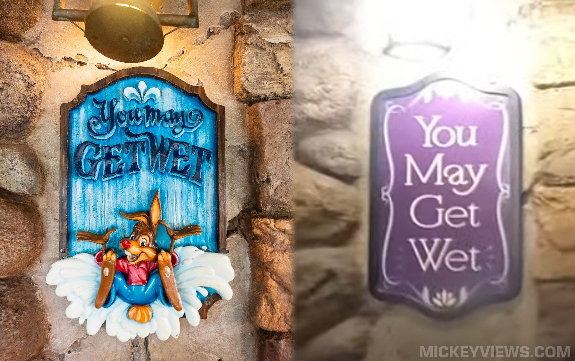
As Disney’s avid fans debate over how “Tiana’s Bayou Adventure” stacks up to the attraction it is replacing, one topic has been the Tiana ride signage.
With the first photos and videos inside the new attraction coming out, we can get a side-by-side look at how its queue signage stacks up to “Splash Mountain!”
“You May Get Wet!”

As you can see, Disney’s creative lead Imagineers Carmen Smith, Charita Carter and Ted Robledo rendered a new impression of the classic “You May Get Wet” sign for their brand new attraction! Which do you prefer?
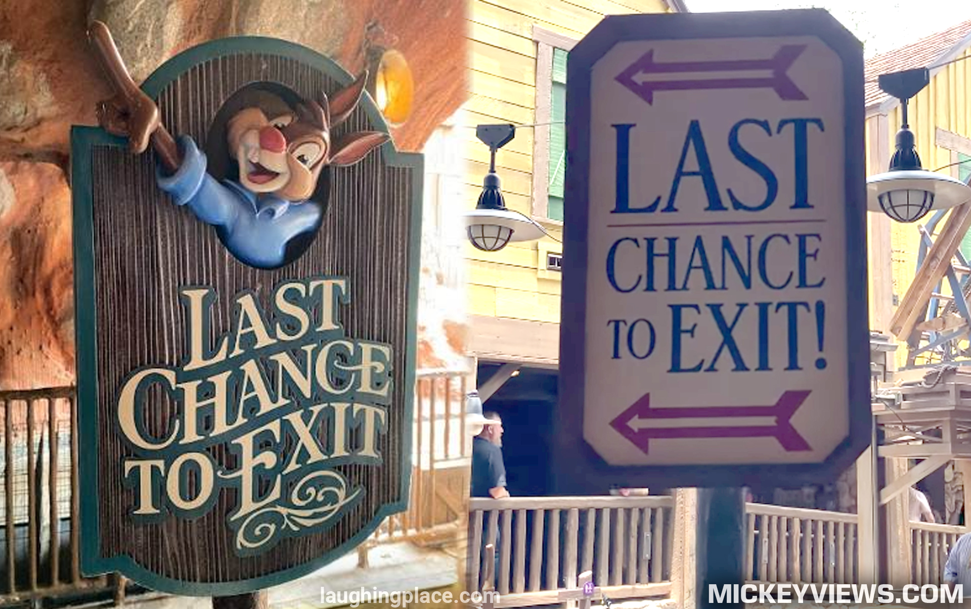
“Last Chance to Exit!”

As you approach the end of the queue, a final call is made via this sign, letting you know if you pass this point you WILL be going down a whimsical flume and a 52 foot drop! “Splash Mountain” and “Tiana’s Bayou Adventure” went with very different styles for this signage. Which do you prefer?
Shoutout to BrerOswald on X for originally creating these comparisons as avid Disney fans continue the deep dive into Disney’s newest attraction!
Heads should roll. pic.twitter.com/d9BPsNMB9G
— Dark Oswald (@BrerOswald) June 3, 2024
So which team are you on? Let us know which ride you think has better signs in the comments below!


I like the crappy Tiana ones better because they aren’t racist like the Splash Mountain signs.
This is the goal of those who chant “End the Patriarchy!” Well, welcome to the Matriarchy!
SM any day, no imagination in the TBS signs what so ever . They can’t even create a better sign over a 30 year old one. 😞
Brayden is naming names and letting the content speak for itself. Love your style, Brayden!